Voyage Tech Blogs

Voyage Technology has been serving the Beaver Dam area since 1999, providing IT Support such as technical helpdesk support, computer support, and consulting to small and medium-sized businesses.

Other Options for Visual Excel Data

Other Options for Visual Excel Data

If you need to condense data into a concise and comprehensible form, Microsoft Excel is tough to beat. This is despite the fact that your average spreadsheet isn’t exactly an eye-catcher. However, Excel provides a few native options that boost your data’s visual appeal, making it more engaging and much more meaningful. We’ll review a few today.

In-Cell Charts and Sparklines
One of the biggest downsides to line after line and row after row of numbers and labels is that it becomes difficult to visualize any patterns. Both of these functions resolve that by providing clear visual cues.

Excel’s Sparkline option displays a miniaturized line graph, bar graph, or win/loss chart within a cell. This adds an added layer to the visualization. So, let’s say you want to track how many sales were made of a certain product or service offering. With a line graph Sparkline, you can create this quick reference:

You also can go even more in-depth with your styling, applying custom rules to your cells to display more granular information. Let’s assume that your goal for these specific sales was to complete at least 16 per month. Utilizing conditional formatting can make it even more obvious when this goal was (and wasn’t) reached.

With your data selected, select Conditional Formatting from the menu ribbon. Click Manage Rules and access your newly-created rule for the data set. You can then play with some of your options. In this example, we decided to use arrows as our icon style and identify 16 as both of our top values and 15 for the bottom. After you hit Apply, your data should appear like this:

As a result, you can see much more quickly which months saw enough sales to reach the set goal, and which did not. This makes it easier to identify other events that may have influenced these numbers and act accordingly.

Turning Pies into Sunburst Charts
A sunburst chart is effectively the combination of multiple pie charts into a single, unified representation. This helps you to spot important patterns that may have been missed if the graphs were left separated.

For example, let’s say you serve a variety of industries, and have specific services for each, with each service divided into tiers. By labelling each industry as 1,2, and 3, with services A, B, and C, and the tiers X, Y, and Z, you can create a sunburst chart that allows you to compare how these sales play as a part of your incoming revenue.

One this data has been divided as pictured, you can apply the sunburst chart to see the following hypothetical:

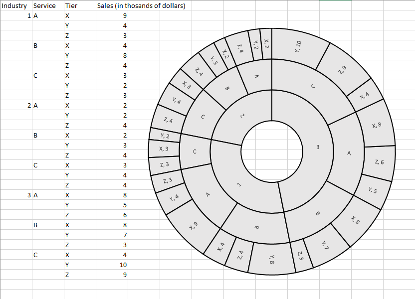
So, while you can see from the data that service 3CY outperforms any other on this chart (most by a considerable margin) by reviewing the data, the sunburst chart provides considerably more insight into this fact - primarily, the significance of such a difference. From there, you can again examine some of the factors surrounding these outcomes and adjust accordingly.

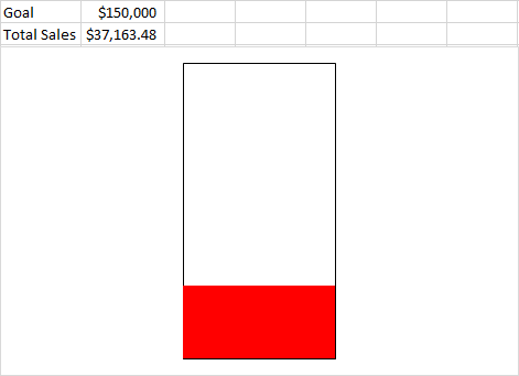
Raising the Bar with a Thermometer Chart
Thermometer chart are great for providing some motivation to your team toward a goal, although it does tend to be used primarily for financial benchmarks. However, this one can be a challenge, so be careful as you follow along.

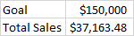
Sticking to the sales usage, let’s say our penultimate goal is $150,000, and there has been $37,163.48.

  • In Excel, insert cells that look like this:
  • Selecting them, click Insert, and under the Column Chart options, add a Clustered Column Chart item. With this item selected, click Switch Row/Column in the menu bar at the top of your screen.
  • Right-click the Total Sales bar and select Format Data Series, then in the Series Options page, select Secondary Axis. You should now only see one bar, with labels on both sides.
  • Right-click the label on the left and select Format Axis. The Axis Options Pane should appear. In the box for Maximum, type in your goal of $150,000. Repeat this process for the label on the right.
  • Right-click the Goal Bar and select the Format Data Point option. Under Fill & Line in the menu that appears, select No fill and make the border a Solid line. Repeat this process with the Total Sales Bar, skipping the “No fill” part and selecting the color you want instead.
  • Finally, you can delete the labels on the bottom and sides (if you wish), as well as the horizontal lines, leaving you with the finished product:

What kind of data would you express better, now that you have these tools to leverage? Share your thoughts in the comments!


Comments

No comments made yet. Be the first to submit a comment
Already Registered? Login Here
Guest
Sunday, 03 May 2026

Captcha Image

Sign Up For Our Newsletter!

Mobile? Grab this Article!

Qr Code

Tag Cloud

Security Technology Tip of the Week Best Practices Data Business Computing Business Productivity Software Innovation Cloud Hackers Efficiency Hardware Network Security User Tips Internet IT Services Malware Phishing IT Support Privacy Google Email Workplace Tips Computer Workplace Strategy Collaboration Small Business Hosted Solutions Backup Users Ransomware AI Managed Service Mobile Device Productivity Microsoft Saving Money Quick Tips Passwords Communication Cybersecurity Smartphone Data Backup Data Recovery Disaster Recovery Android Upgrade VoIP Business Management Smartphones Mobile Devices communications Windows Browser Social Media Microsoft Office Managed IT Services Current Events Network Tech Term Internet of Things Remote Information Miscellaneous Artificial Intelligence Facebook Holiday Automation Compliance Cloud Computing Covid-19 Gadgets Training Outsourced IT Managed Service Provider IT Support Remote Work Server Employee/Employer Relationship Encryption Spam Windows 10 Office Data Management Government Business Continuity Windows 10 Bandwidth Blockchain Virtualization Business Technology Wi-Fi Two-factor Authentication Mobile Office Data Security Vendor Apps Managed Services Networking Mobile Device Management Chrome Gmail Budget BYOD WiFi Apple App Employer-Employee Relationship Tip of the week Voice over Internet Protocol Marketing Office 365 Managed IT Services How To BDR Password HIPAA Physical Security Applications Access Control Computing Hacker Conferencing Information Technology Avoiding Downtime Website Analytics Office Tips Augmented Reality Storage Bring Your Own Device Router Big Data Virtual Private Network Health 2FA Help Desk Operating System Computers Retail Risk Management Healthcare Scam Data loss Cooperation Free Resource Project Management Firewall Windows 7 Patch Management Save Money Microsoft 365 Remote Monitoring Vulnerability End of Support Vendor Management Solutions The Internet of Things Social Display Printer Paperless Office Windows 11 Going Green Infrastructure Monitoring Customer Service Excel Cybercrime Document Management Remote Workers Managed IT Service Telephone Virtual Desktop iPhone Data storage LiFi Licensing Word Entertainment Vulnerabilities Outlook Data Privacy Images 101 Money Humor Telephone System Multi-Factor Authentication Robot Mobility Cost Management Safety Sports Mouse IT Management VPN Employees Meetings Administration Integration User Tip Modem Processor Computer Repair Mobile Security Holidays Customer Relationship Management Settings Data Storage Wireless Smart Technology Supply Chain Printing Content Filtering Video Conferencing Machine Learning Managed Services Provider Hacking Saving Time Virtual Machines Professional Services Presentation YouTube Cryptocurrency Wireless Technology Maintenance Downloads Antivirus Browsers Smartwatch Connectivity IT Social Engineering Break Fix Scams Google Wallet Recovery Upload Procurement Remote Computing Azure Hybrid Work Cyber security Multi-Factor Security Tech Human Resources Hard Drives Windows 8 Laptop Social Network Telework CES Tablet IoT Communitications Dark Web Cables Domains Drones Trends Supply Chain Management Alert Managed IT Customer Resource management FinTech File Sharing Regulations Dark Data Google Calendar Term Google Apps Refrigeration Halloween Data Analysis Star Wars IT Assessment How To Microsoft Excel IT Maintenance Public Speaking Notifications Staff Value Business Intelligence Lithium-ion battery Gamification Flexibility Organization Travel Social Networking Legislation Shortcuts Hacks Entrepreneur Scary Stories Techology Fileless Malware Digital Security Cameras Fun Google Maps Smart Devices Ransmoware Wearable Technology Memory Vendors Deep Learning Content Remote Working Health IT Unified Threat Management Motherboard Data Breach Comparison Google Play Be Proactive Undo Education Unified Threat Management Directions Videos Assessment Electronic Health Records Permissions Workforce Wasting Time Threats Trend Micro Network Congestion Specifications Security Cameras Workplace Strategies Mobile Computing User Error Microchip Search Internet Exlporer Software as a Service Fraud Meta Managing Costs Amazon Application Best Practice Username Point of Sale eCommerce Black Friday SSID Buisness IT solutions Database Surveillance Virtual Assistant Outsource IT IBM Legal Tech Support IT Technicians Virtual Machine Environment Media Business Growth Network Management Proxy Server Reviews Cookies Monitors Cyber Monday Medical IT Cortana Tactics Development Hotspot Transportation Small Businesses Websites Mirgation Hypervisor Displays Alt Codes Shopping Nanotechnology Optimization PowerPoint Competition Downtime Hosted Solution SharePoint Addiction Electronic Medical Records Language Employer/Employee Relationships Outsourcing Chatbots Navigation Typing Management PCI DSS Lenovo Gig Economy Screen Reader Writing Distributed Denial of Service Workplace User Knowledge Service Level Agreement Internet Service Provider Virtual Reality Computing Infrastructure Teamwork Hiring/Firing Google Drive Private Cloud Identity Evernote Paperless Server Management Regulations Compliance Superfish Bookmark 5G Identity Theft Smart Tech Memes Co-managed IT Google Docs Unified Communications Experience Download Net Neutrality Twitter Alerts SQL Server Technology Care IP Address Error History Business Communications Bitcoin Running Cable Financial Data

Blog Archive